Glam9 is a gender-inclusive salon booking app crafted to simplify the way people discover, evaluate, and book grooming services. Designed with a mobile-first mindset, the app offers personalized recommendations, real-time availability, and a frictionless experience. This case study showcases how I focused on reducing friction and minimizing the number of steps required to complete a booking enabling users to find and confirm appointments quickly, with minimal clicks and maximum clarity. From uncovering user pain points to designing an intuitive, efficient flow, this project reflects a user-first approach at every stage of the design process.
Role &
Responsibility
I led the entire design process for the customer-facing side of Glam9, from research and ideation to final delivery. While the overall project involved multiple roles working on salon/vendor dashboards and backend systems, I was solely responsible for defining the experience, design system, and interaction flow of the customer app.
Requirement Gathering (Customer Side)
Defined goals by aligning with business needs and identifying key user pain points in the booking journey.
User Research & Insights
Conducted user interviews and surveys to understand behavior, frustrations, and expectations when booking grooming services.
User Journey Mapping
Mapped the ideal customer journey to reduce friction, focusing on quick discovery, comparison, and booking of services.
Wireframes & Booking Flow Design
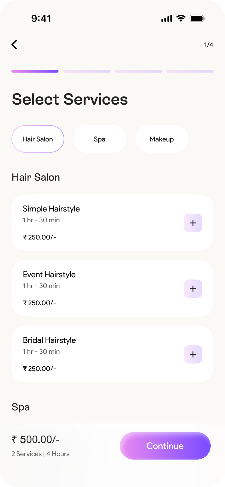
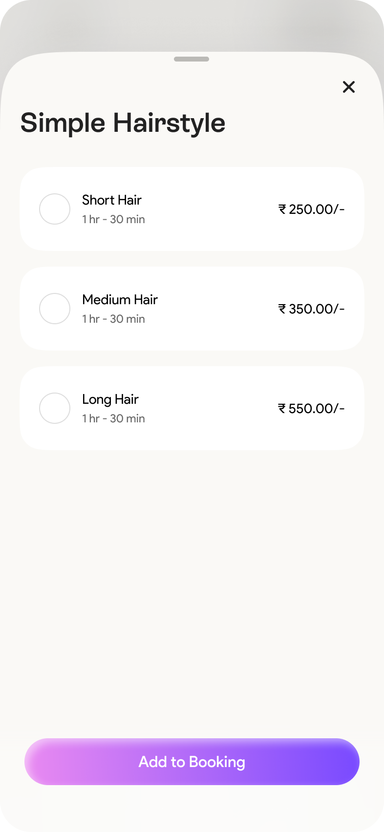
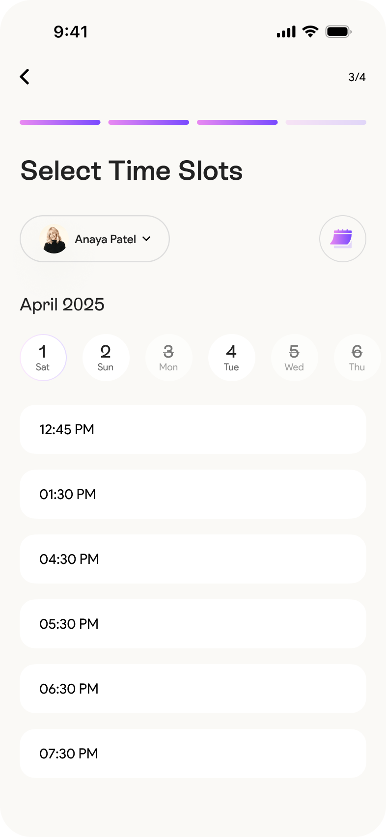
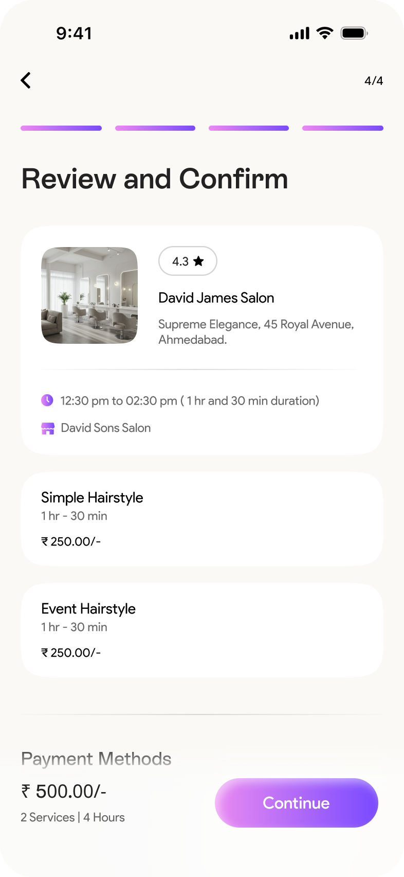
Designed intuitive wireframes that simplified the booking process with fewer steps and clear visual guidance.
Design System
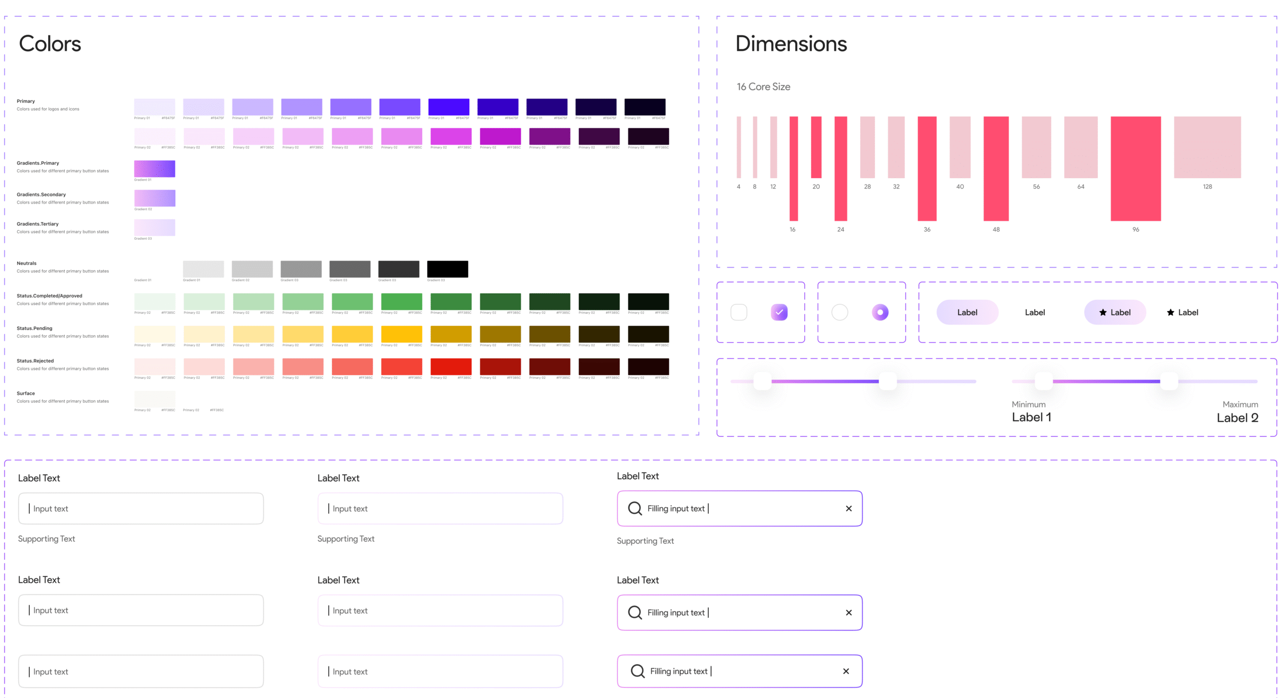
Led the creation of a modular design system specifically for the customer app. Defined foundational tokens, UI components, and interaction patterns to ensure visual consistency, scalability, and efficient developer handoff.
UI Design – Customer App
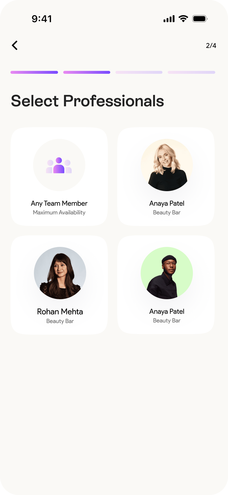
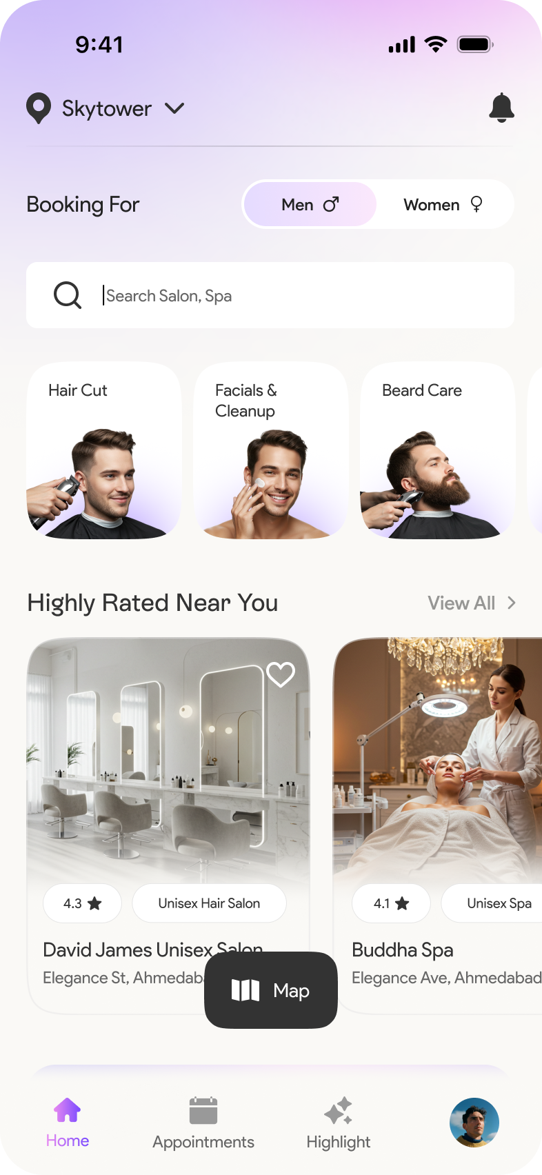
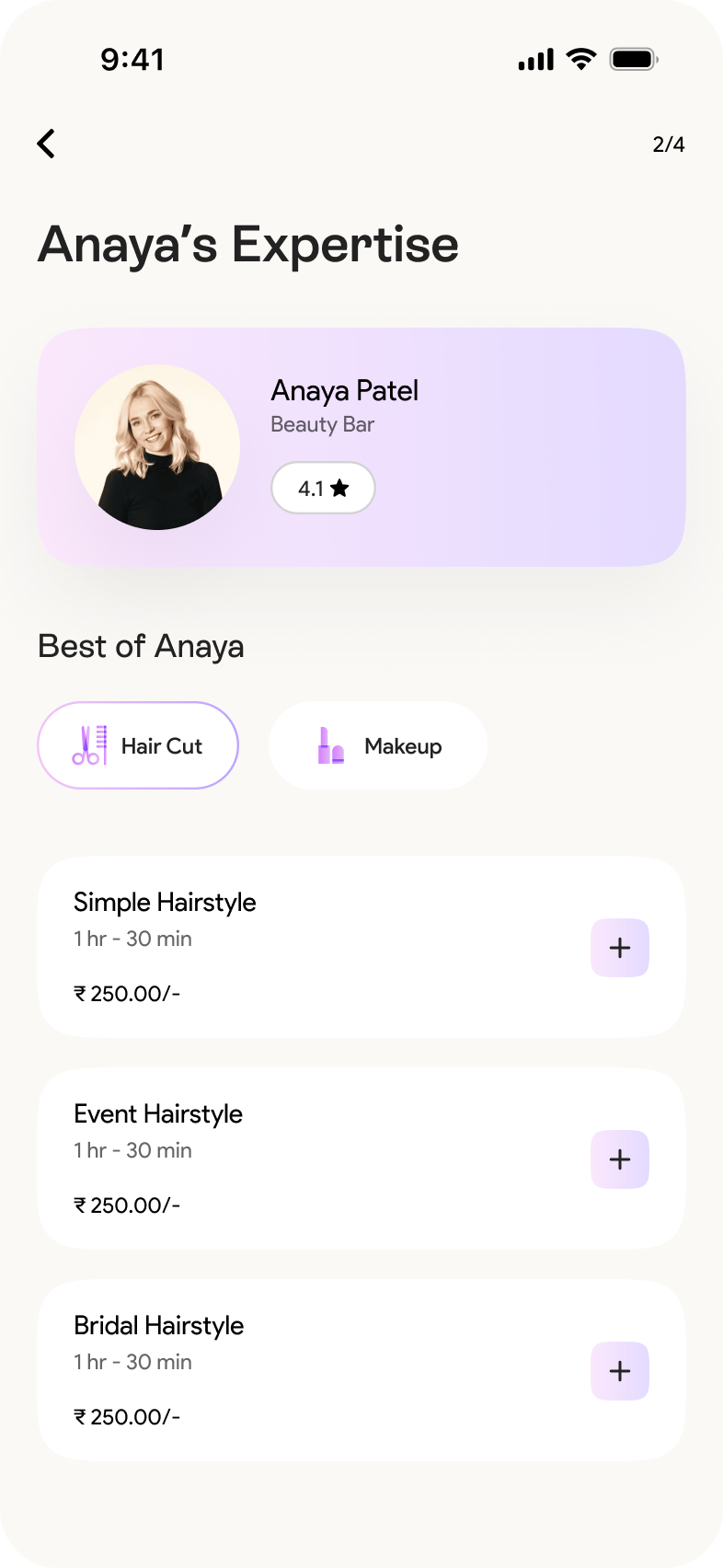
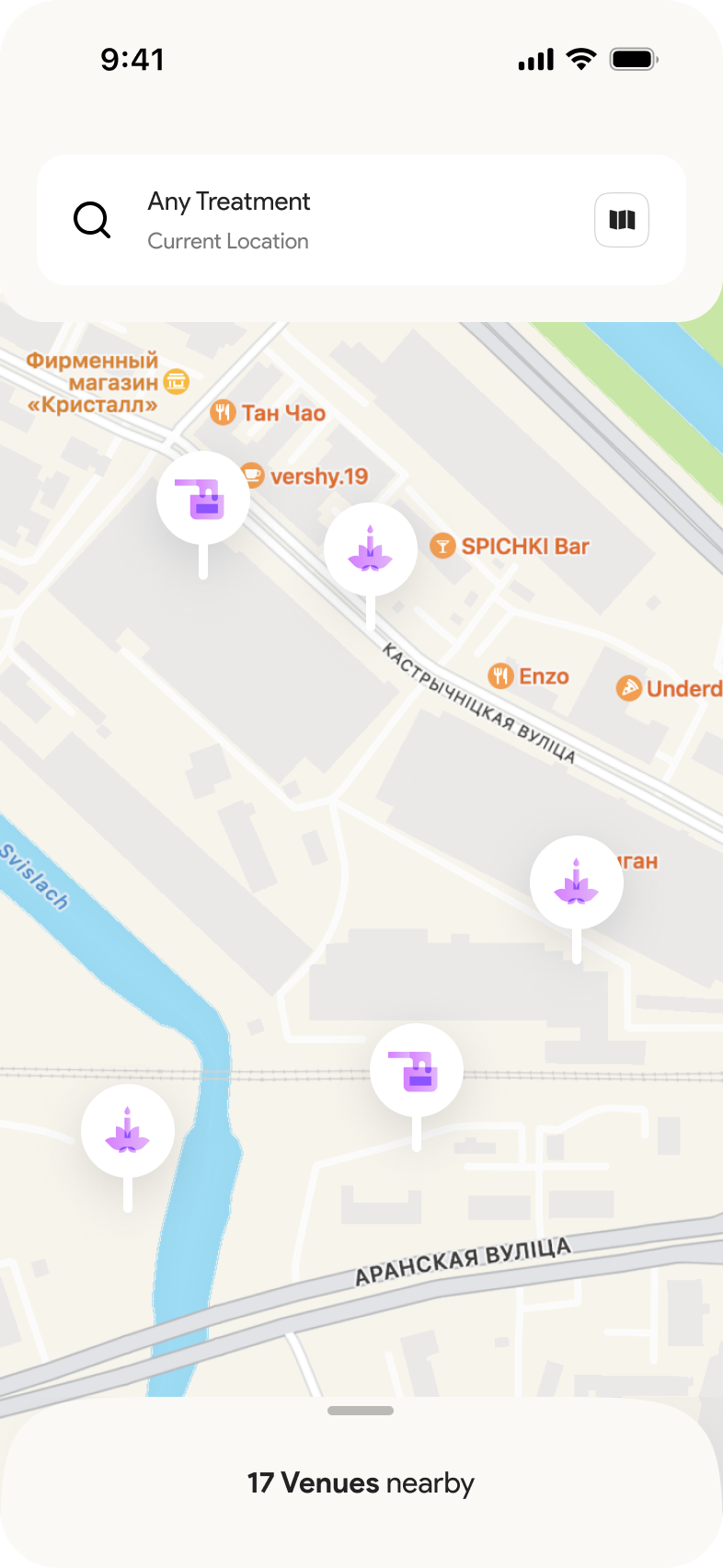
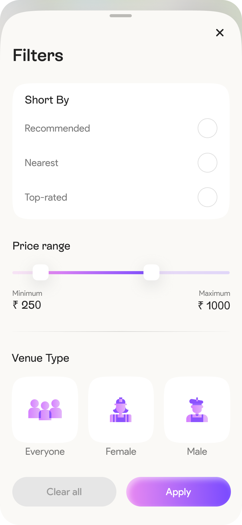
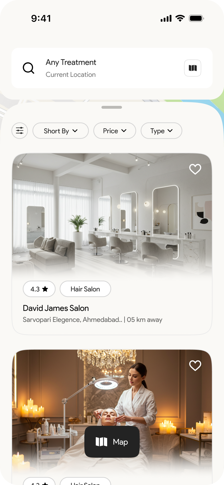
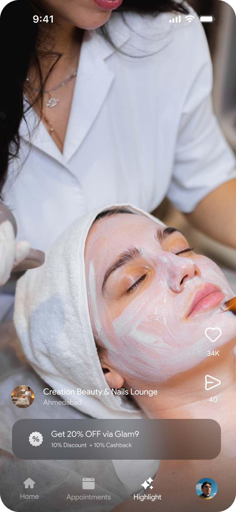
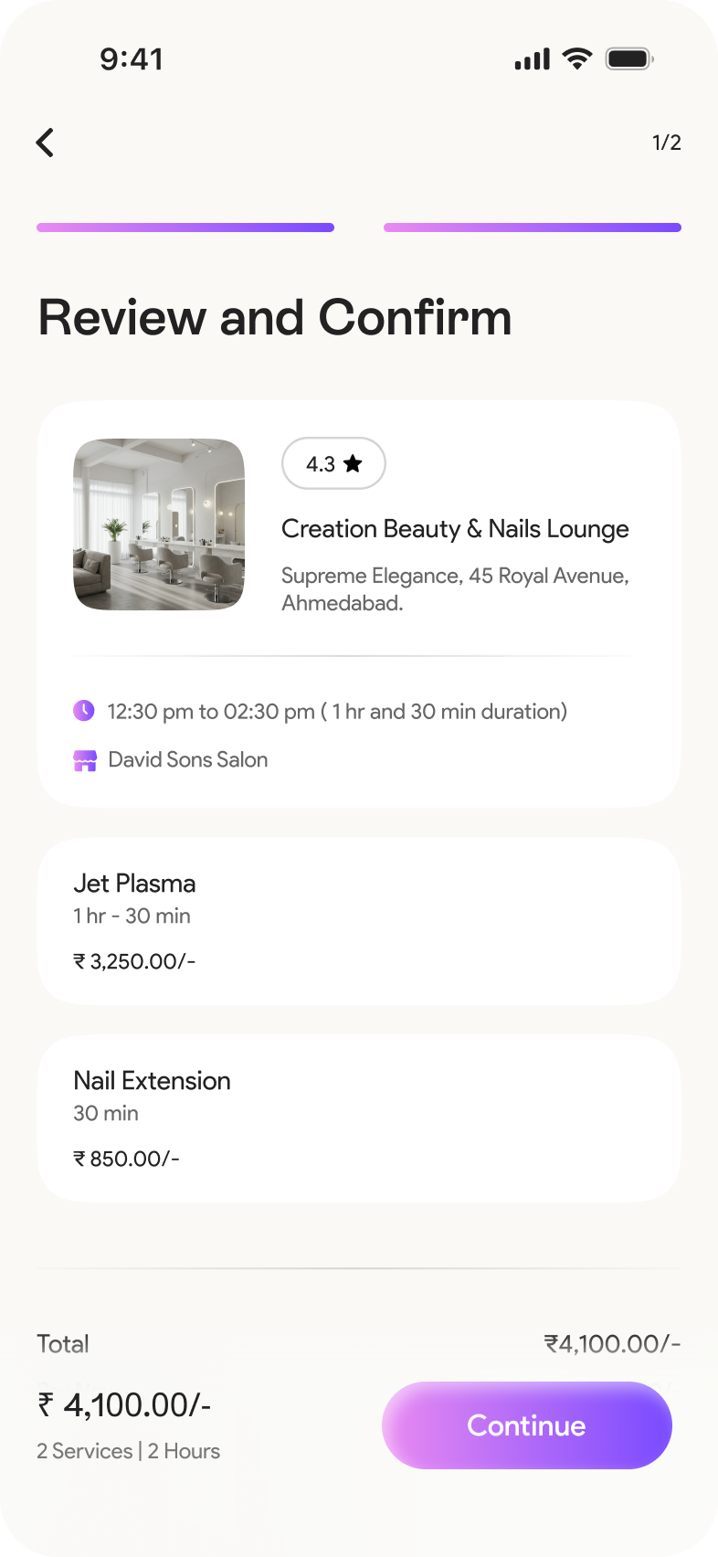
Created a clean, mobile-first interface with clear CTAs, filters, gender-based listings, and responsive components.
Team Collaboration
Ran usability tests on key booking screens and applied findings to refine flow, reduce cognitive load, and improve conversion.
Final Delivery
Delivered polished UI screens, component documentation, and developer-ready assets for a smooth handoff.
Why This Matters to Me the Most
At first glance, building a salon booking app seemed straightforward just a calendar, time slots, and a few screens. With so many competitors in the space, it was easy to find references for the basic flow. But the real challenge wasn’t just creating another booking app it was crafting a smoother, smarter, and more intuitive experience that actually delights users. What mattered most to me was simplifying the process for real people: helping them discover the right service, choose with confidence, and book in seconds not minutes. I wanted Glam9 to stand out not by complexity, but by clarity especially when dealing with heavy offers, personalized listings, and gender-based preferences. My goal was simple: reduce user effort, increase trust, and make the booking flow feel effortless.
Key Challenges & Solutions
User Experience & Flow
Challenge
Users often abandoned bookings due to lengthy, confusing flows in other apps.
Solution :
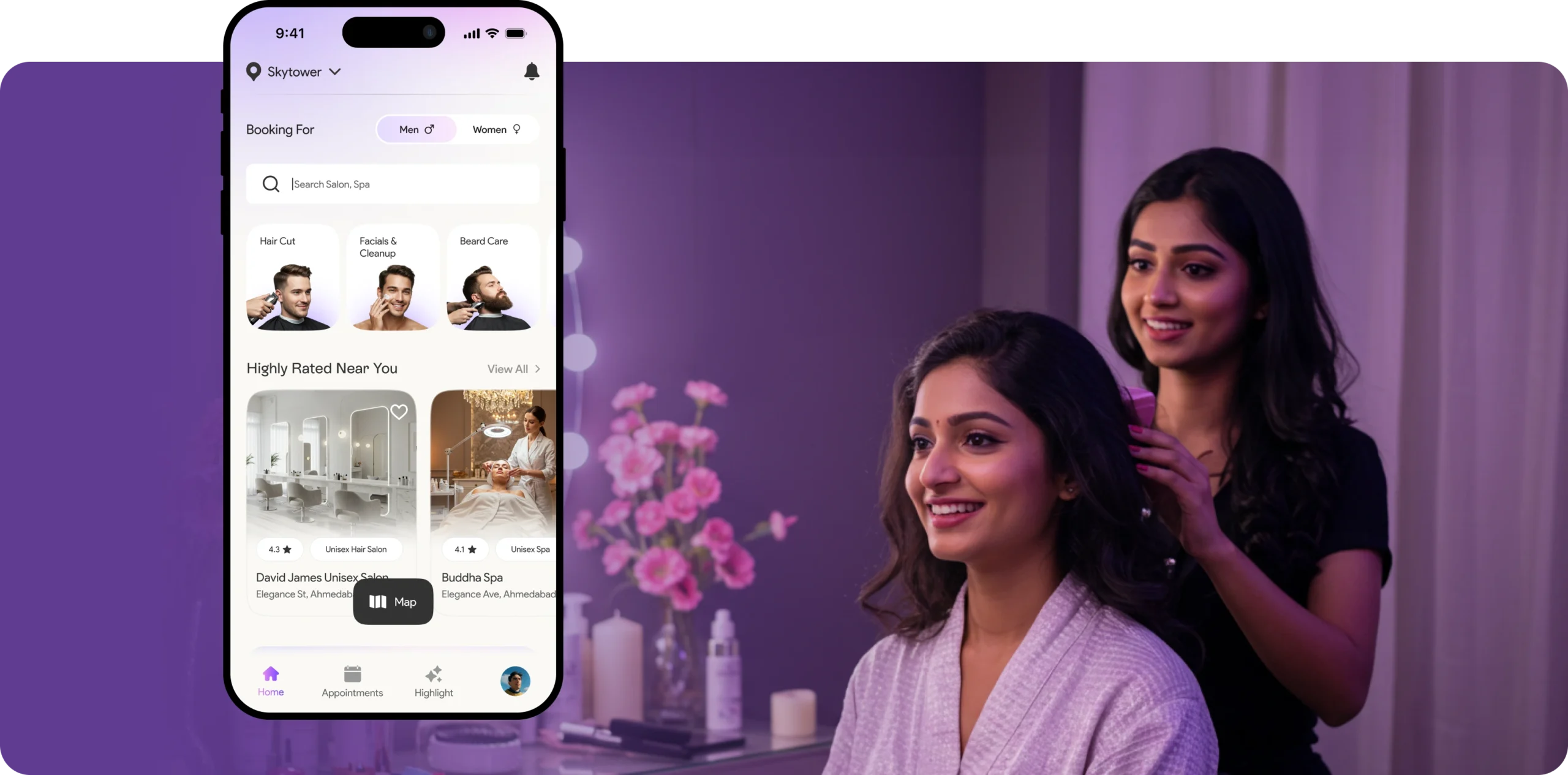
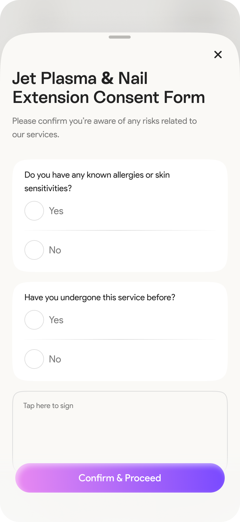
Added a global gender switcher on the home screen, enabling users to toggle between Men’s, Women’s, and Unisex salons ensuring relevant listings instantly.
Visual Clarity & Offer Overload
Challenge :
Users struggled to find appropriate services when booking for others (e.g., opposite gender).
Solution :
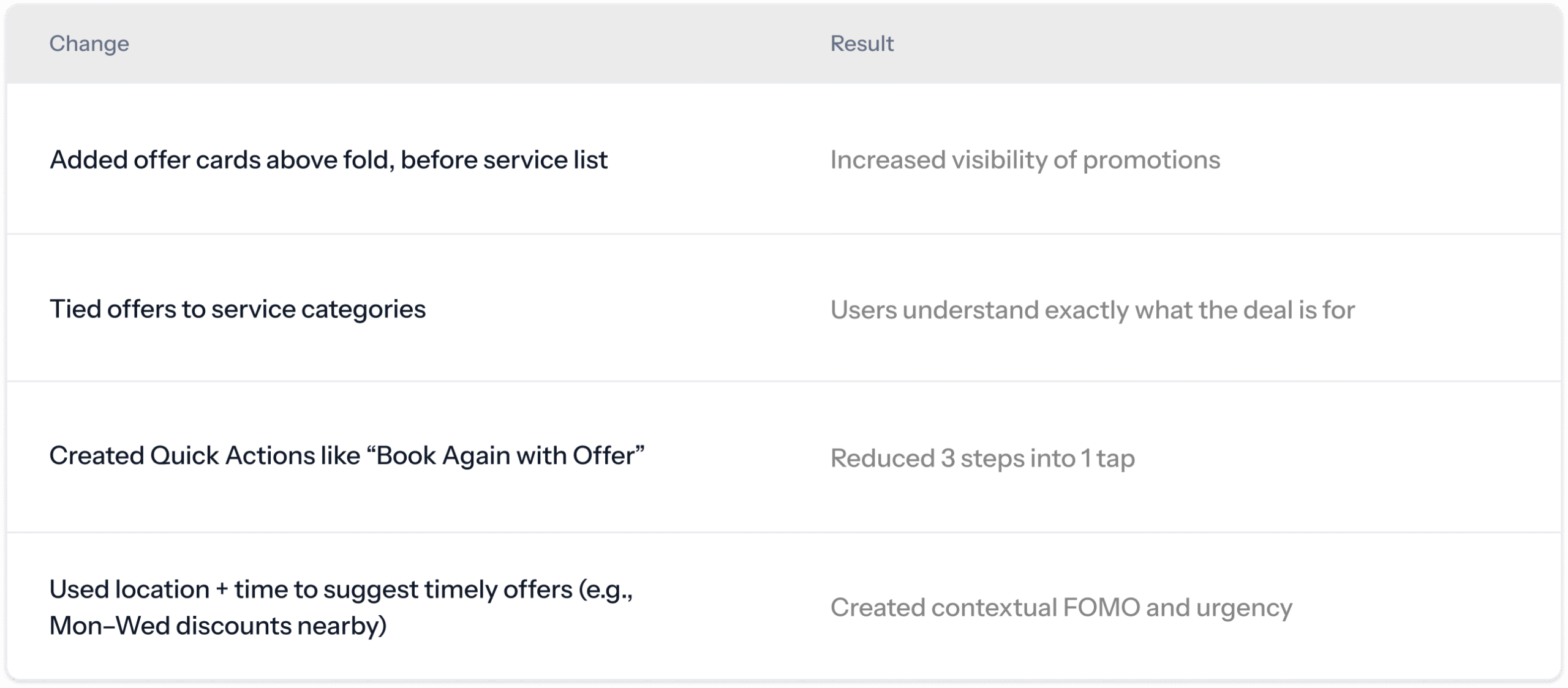
Created a smart offers carousel with location and time-sensitive deals, and added an optional “Offers Near Me” filter to keep the experience focused yet enticing.
Building Trust in Salon Listings
Challenge :
New users were hesitant to book with unfamiliar salons due to lack of credibility or details.
Solution :
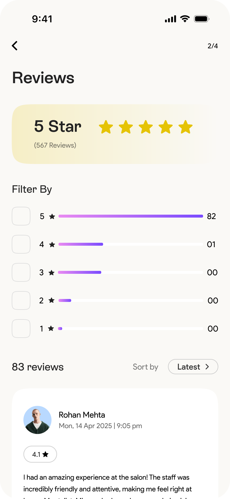
Enhanced salon profiles with verified tags, detailed service info, reviews, stylist portfolios, and real service images helping users book with confidence.
Design Consistency & Scalability
Challenge :
The app needed to look and work great across all screen sizes without breaking the design.
Solution :
Built a modular design system with reusable components, scalable layout grids, and responsive design rules to ensure consistency and adaptability.
Design Thinking
Understand
Researched user habits and frustrations with current salon booking apps
Analyzed key competitors to understand baseline expectations and missed UX opportunities
Define
Understanding Problem and Business goal
Crafted the core problem
Ideate
Sketched initial user flows and mind maps to visualize booking journeys
Explored layout ideas for homepage, filters, and service selection
Brainstormed how to reduce steps and highlight relevant offers
Prototype
Design Structure & Design System
low- to high-fidelity wireframe
Mobile-first UI
Understand
1. Researched user habits and frustrations with current
salon booking apps
To avoid assumptions and design with purpose, I needed to understand real user pain points, habits, and expectations. This helped me uncover key booking frustrations and set a clear direction for a user-first experience.
2. Analyzed key competitors to understand baseline expectations and
missed UX opportunities
I first needed to understand what users already expect and what’s missing. Analyzing key competitors helped me uncover common patterns, identify overlooked UX gaps, and find opportunities where Glam9 could stand out with a more refined, user-first experience.
My Perspective After the Understanding Phase
Going into this project, I assumed salon booking would be a simple flow pick a service, select a time, and confirm. But once I started talking to real users and digging into their actual experiences, I realized how many small pain points were getting in the way of a smooth journey. From not trusting the offers, to confusion about slot availability, to just giving up mid-booking I saw a clear pattern of frustration. This phase helped me stop designing based on assumptions and instead focus on what really matters to users. It gave me the clarity I needed to move forward with purpose and empathy.
Define
1. Understanding Problem and Business goal
Before jumping into solutions, I took a step back to understand both the user’s challenges and the business objectives. This helped me align the design direction with real-world needs ensuring we solve the right problems while also supporting Glam9’s growth strategy.
The Real Problem
Users hesitate to book through aggregator apps due to unclear or late-revealed offers, trust issues with unknown salons, and multi-step payment redirections. They often prefer direct booking to save time and money — causing drop-offs in Glam9’s booking flow
Business Goal
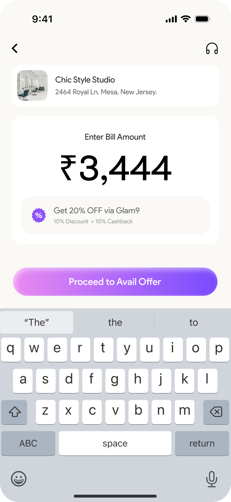
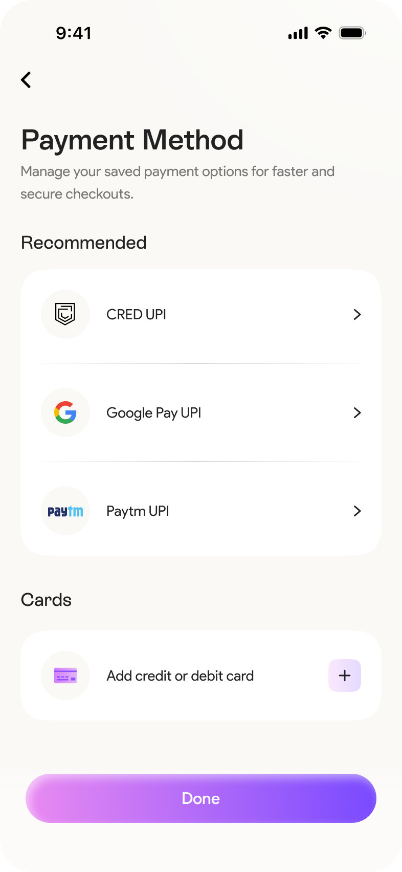
Encourage users to complete bookings directly through Glam9 by introducing Glam-a-Pay, providing instant discounts, and creating a loyalty incentive loop that keeps users on the platform.
Build trust through verified salons and upfront pricing
Promote Glam-a-Pay as faster, simpler, more rewarding
Reduce drop-offs by simplifying flow and highlighting exclusivity
UX Approach (Your Solution Direction)
Users hesitate to book through aggregator apps due to unclear or late-revealed offers, trust issues with unknown salons, and multi-step payment redirections. They often prefer direct booking to save time and money — causing drop-offs in Glam9’s booking flow
Clarify Value
Early
Place deals and Glam-a-Pay savings upfront before the user clicks “Book Now”.
One-Tap Payment
with Glam-a-Pay
Allow seamless in-app payment with visible trust badges, no redirection.
Show Benefits with
Every Interaction
Book via Glam-a-Pay and save ₹75 + 1 reward point.
Personalized Offers
Based on Behavior
Return users see targeted offers haircut, waxing, etc.
2. Insight Clustering – Turning Raw Research
into UX Focus Areas
To define the right problems, I analyzed recurring user pain points from interviews and surveys. I grouped these into key experience themes that directly influenced Glam9’s UX direction.
My Perspective After the Define Phase
This phase gave me the clarity I needed to move forward with intention. By breaking down user feedback and clustering insights, I realized that many of the booking drop-offs weren’t just about bad UI they were rooted in trust, unclear value, and friction in payment. It helped me reframe the challenge: instead of just making the flow shorter, I had to make it feel more reassuring and rewarding. Defining the problem alongside the business goal aligned my next steps. I wasn’t just designing a booking tool I was designing a reason for users to stay loyal to Glam9.
Ideate
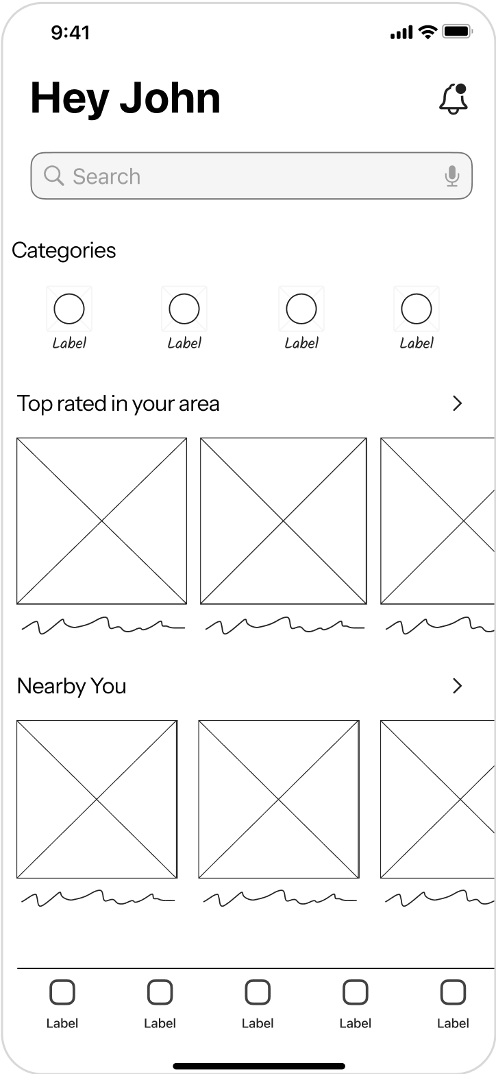
1. Sketched initial user flows and mind maps to visualize booking journeys
Mapping out early user flows and mind maps helped me break down complex booking journeys into simple, actionable steps. It allowed me to identify friction points early and set the foundation for a seamless, low-effort booking experience.
2. Explored layout ideas for homepage, filters, and service selection
I experimented with different layout structures to find the right balance between visual hierarchy, usability, and business goals. This exploration helped shape intuitive navigation for the homepage, refined filtering interactions, and made service selection feel effortless.
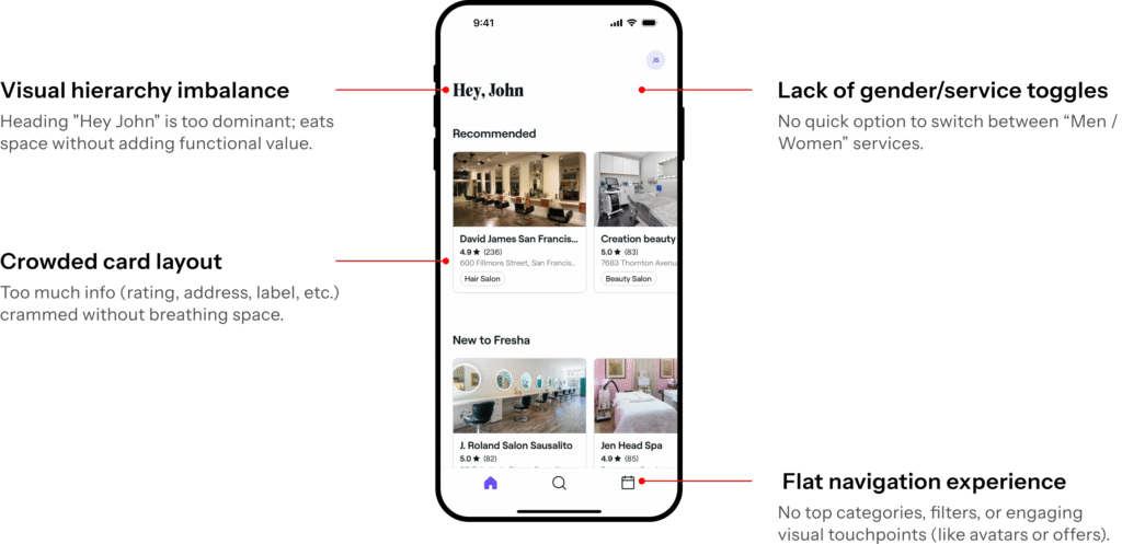
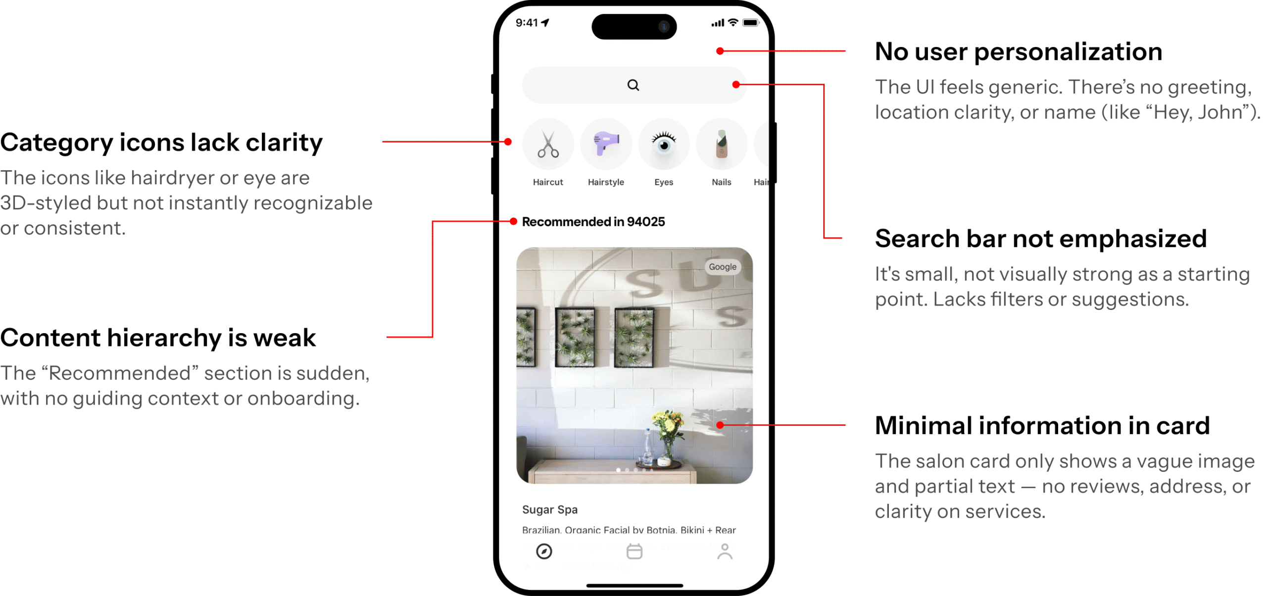
Fresha funneling
Square Go Funneling
Funneling Approaches
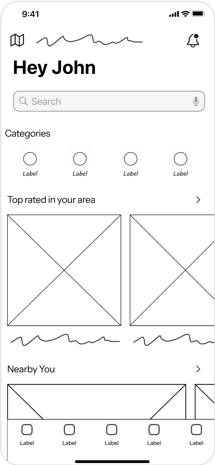
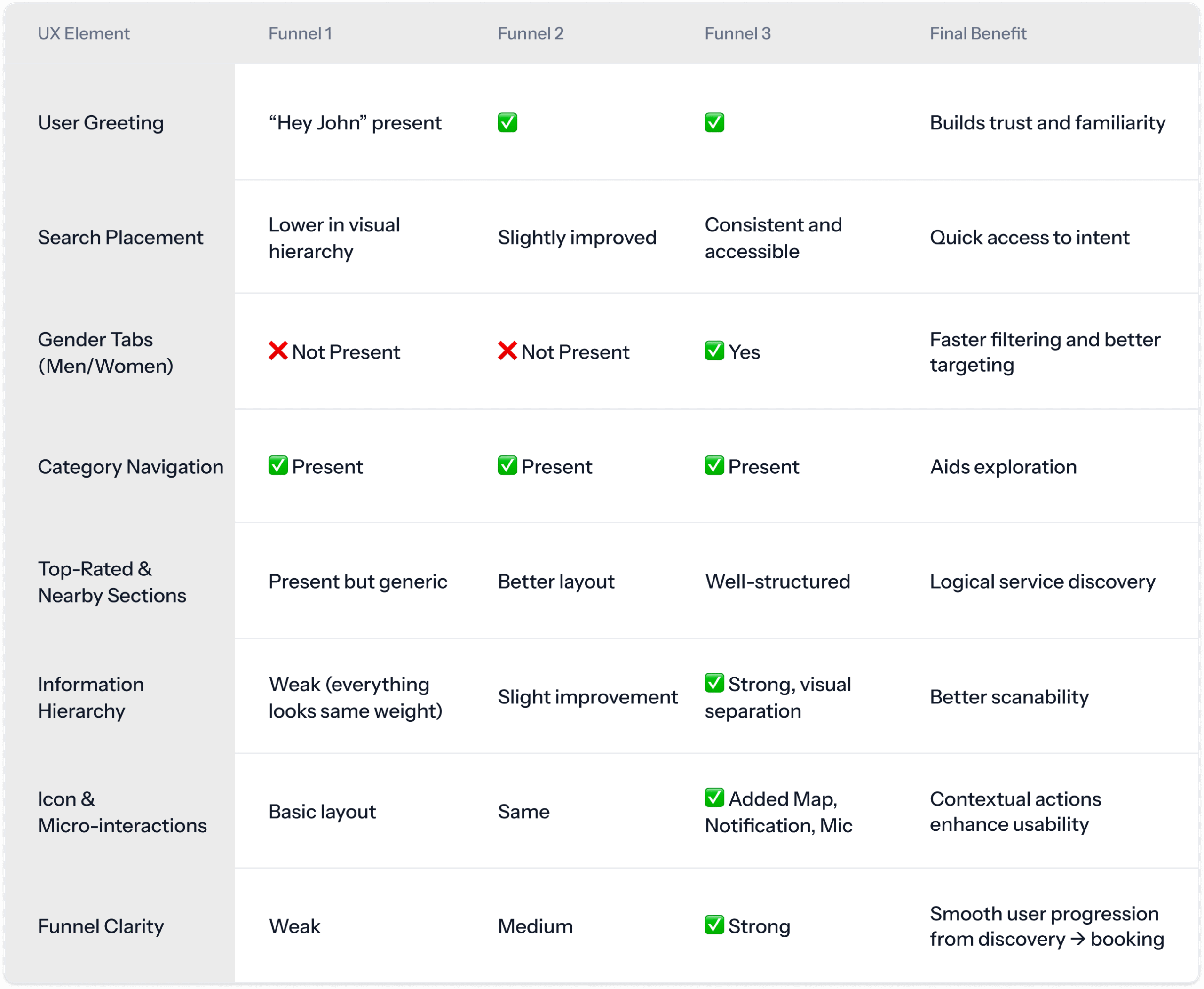
Funnel 1
Basic layout with no gender filter, lacks personalization or hierarchy.
Funnel 2
Slight improvement in layout; still lacks user funneling and identity context.
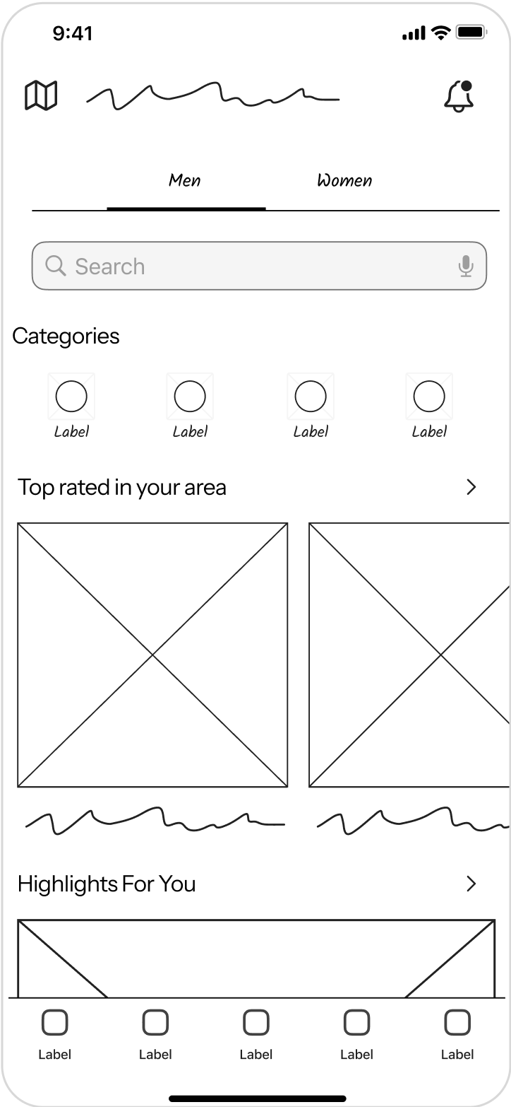
Funnel 3
Refined version with gender tabs, clear personalization, and better structure.
3. Brainstormed how to reduce steps and highlight relevant offers
I focused on simplifying the booking journey by minimizing unnecessary steps and making relevant offers more visible at the right moments. This helped create a smoother experience while also supporting conversion through timely, contextual incentives.
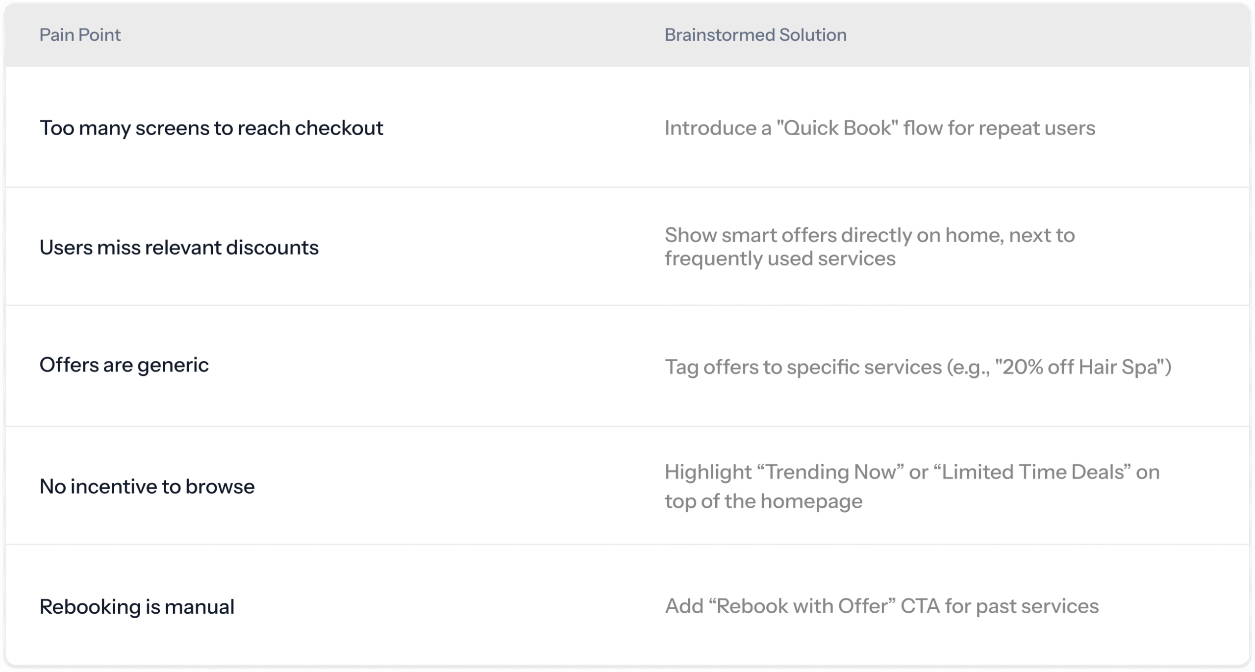
Problem Statement
Users were taking too many steps to complete a booking and often missed out on ongoing offers because they were either hidden deep in the flow or not contextually relevant.
Although this project is still under development and pending user testing, working on Stackit has already taught me a great deal about designing for complex, two-sided fintech systems. One of the key takeaways was learning how to balance the needs of both users and merchants while keeping the experience seamless across mobile and web. I also gained deeper insight into the importance of trust in financial UX where even a small visual or copy inconsistency can impact user confidence. Creating a scalable design system early helped me work more efficiently and maintain consistency as the product evolved. Simplifying the logic of splitting a bill across multiple cards into a clear, intuitive flow was a rewarding challenge. Lastly, applying brand colors and tone cohesively across UI, components, and illustrations sharpened my ability to translate identity into product design.