My journey of building Glam9’s first design system — bringing visual consistency, speeding up delivery, and freeing both designers and developers to focus on what matters most.
Context
When I joined Glam9, the app was live but lacked visual consistency and felt outdated. This case study shares how I built Glam9’s first design system to modernize the experience, speed up delivery, and lay the groundwork for scalable, consistent design.
My Role
System Architecture, UI Design, Documentation, Figma Management
Significantly reduced UI rework, improved design consistency, and saved hours of dev time on every release.
The Challenge
Although Glam9 aimed to offer a premium salon booking experience, the app suffered from key design challenges that impacted usability and efficiency :
Inconsistency Across Screens : Each screen followed a different design language, resulting in a disjointed and unpolished user experience that didn’t align with Glam9’s premium positioning.
Unstructured Typography : Multiple font styles were used without a clear hierarchy or system, making the interface feel cluttered and reducing readability across devices.
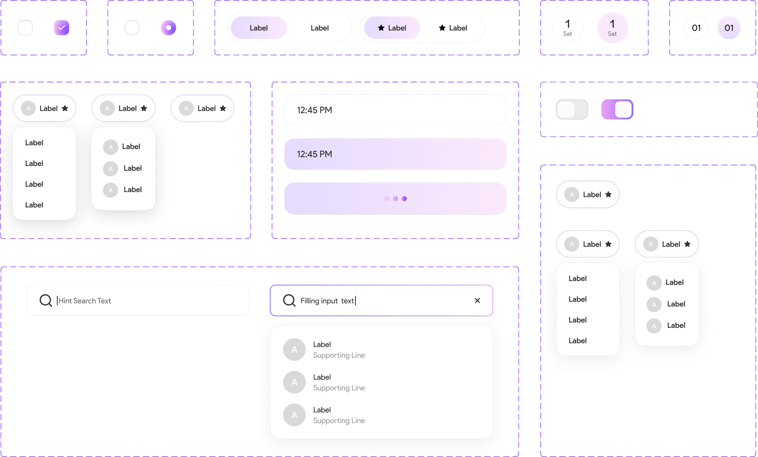
Hardcoded UI Elements : UI components were manually styled for each screen, which made even the smallest design updates time-consuming and error-prone for developers.
But Wait...
Planning
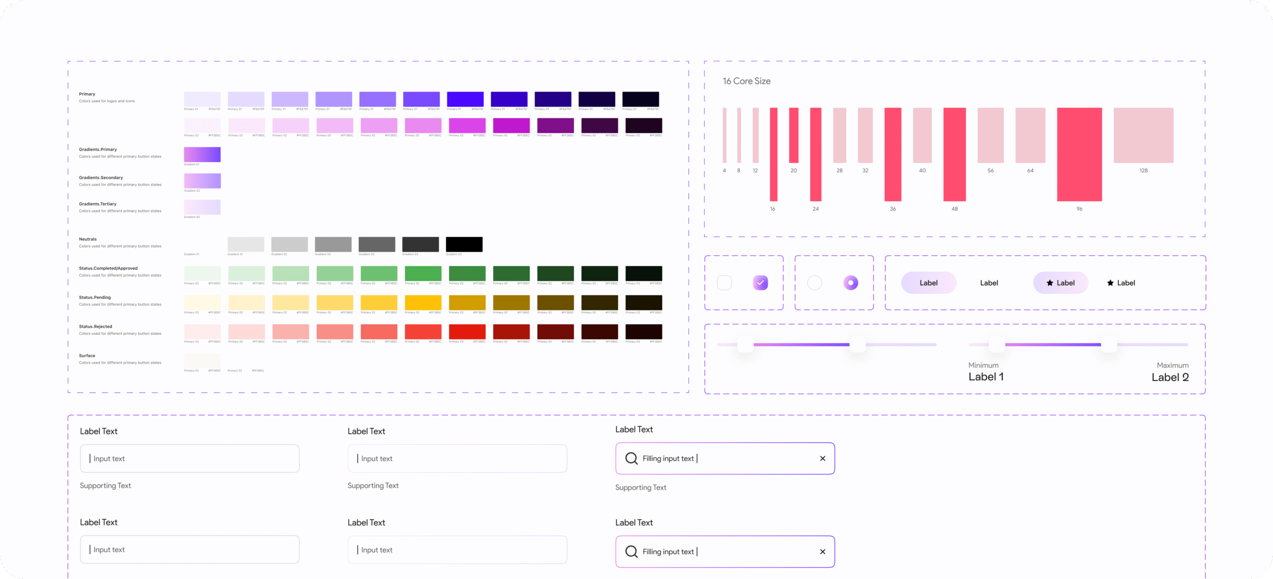
The first step was a detailed audit of our existing UI components. Since Glam9 is built for customers looking for premium, trusted salon services, it was essential that our UI reflect professionalism, ease, and a modern aesthetic. This meant reassessing everything from inconsistent button styles and typography to outdated color schemes and aligning them with a system that feels clean, intuitive, and consistent across every screen and touchpoint.
I planned I’ll first define foundational elements and then create components out of it (pretty simple approach).
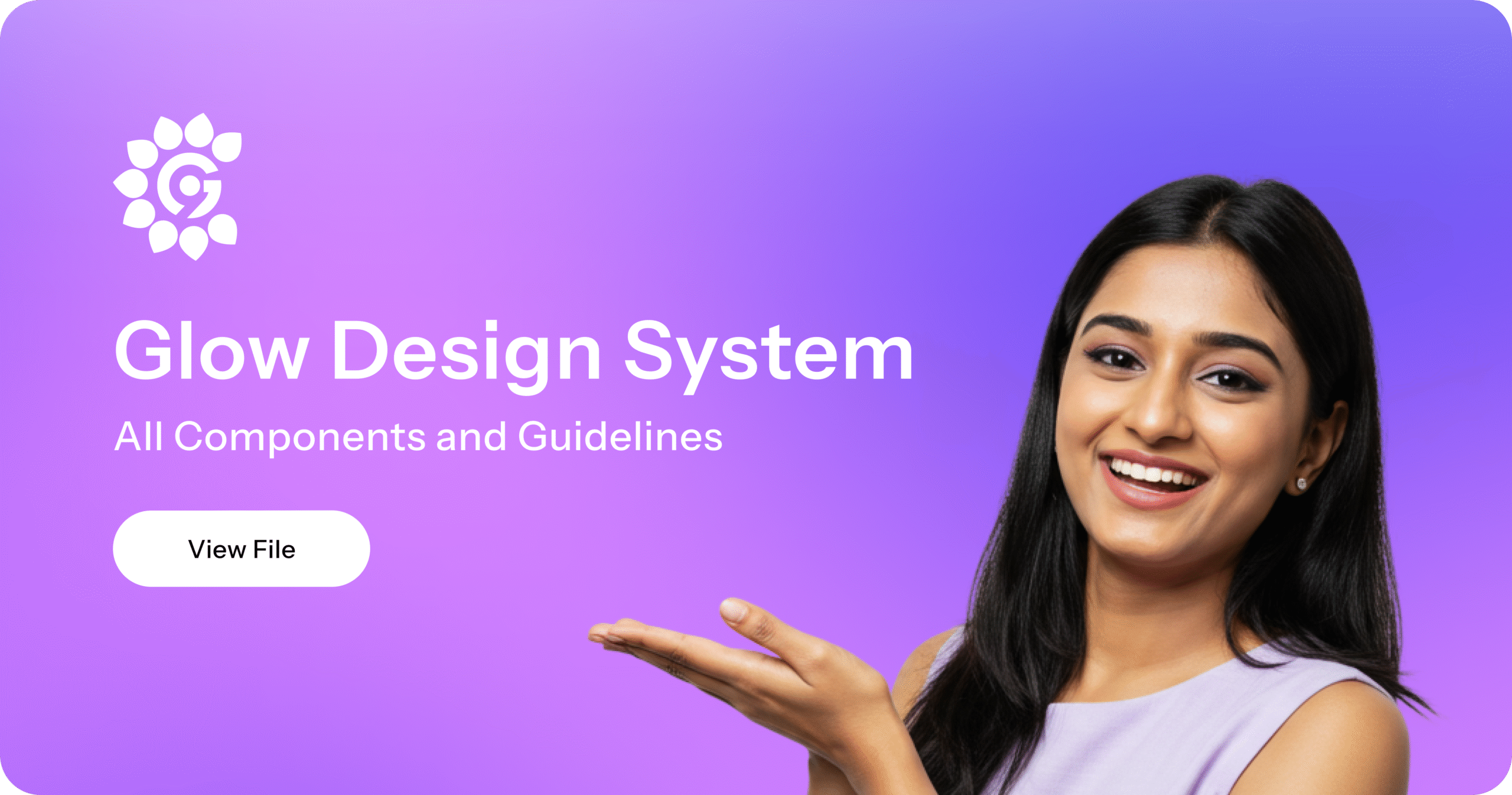
I named the design system “Glow” because it reflects the core essence of Glam9 beauty, clarity, and confidence. The word “Glow” evokes a sense of polished elegance and visual harmony, which aligns perfectly with the salon industry’s focus on enhancing appearance and self-care.
Just like a flawless finish after a salon visit, Glow brings consistency, structure, and smoothness to the product’s UI. It’s simple, memorable, and captures the feeling of a refined, well-lit interface — exactly what Glam9’s users deserve.
Colors
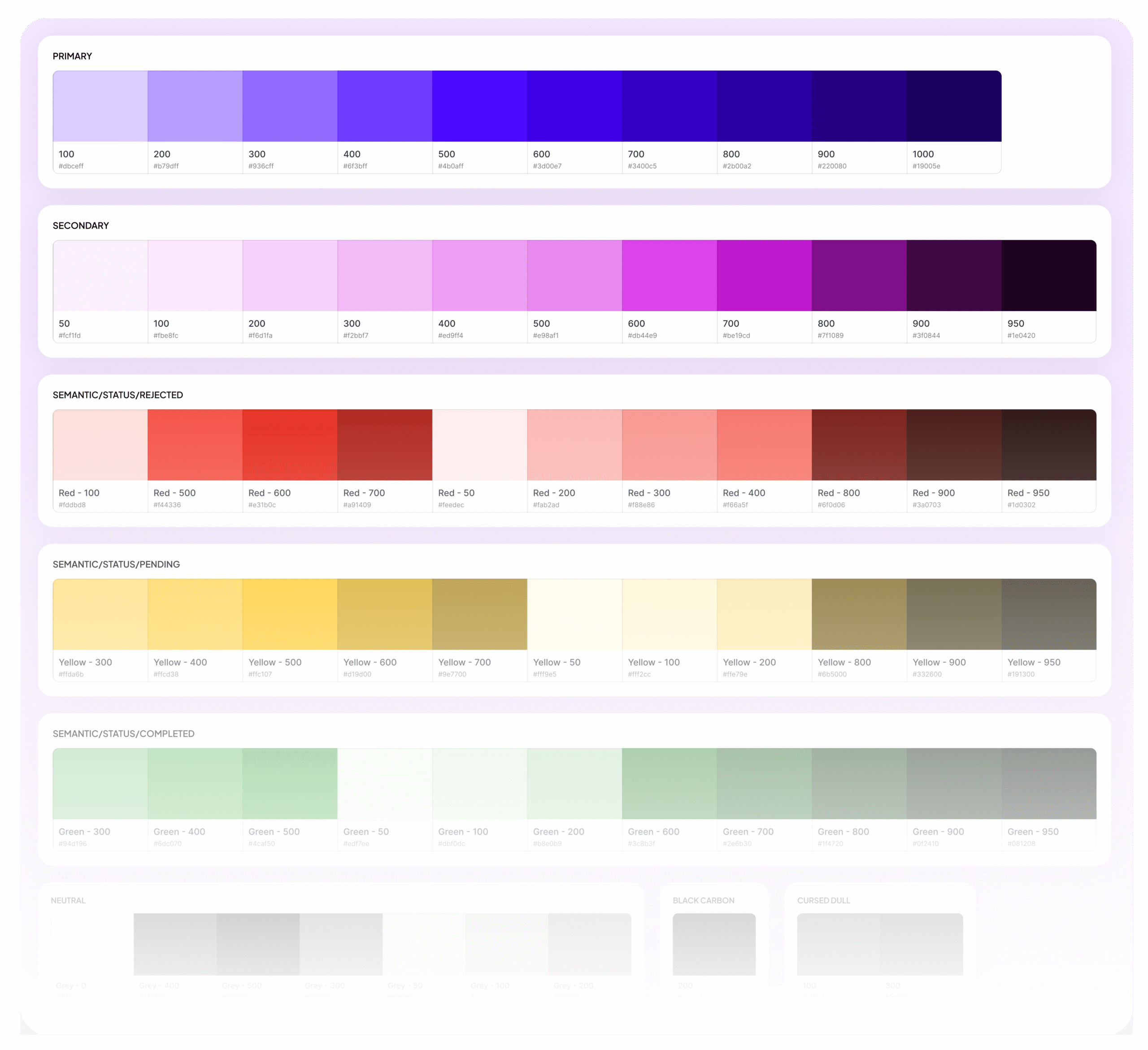
To ensure visual consistency across the product and streamline collaboration between design and development, I introduced a design token approach to manage our color palette. Each color was systematically named based on purpose (e.g., primary, neutral, success, error) rather than arbitrary hex codes.
Using local variables in Figma, we built a centralized color system that was easy to maintain, easy to hand off, and flexible enough to scale. Since Glam9 operates in light mode only, the palette was optimized for readability, elegance, and accessibility without the added complexity of theme switching.
This system helped the team move faster, reduced visual discrepancies across screens, and gave Glam9 a clean, premium aesthetic.
Typography
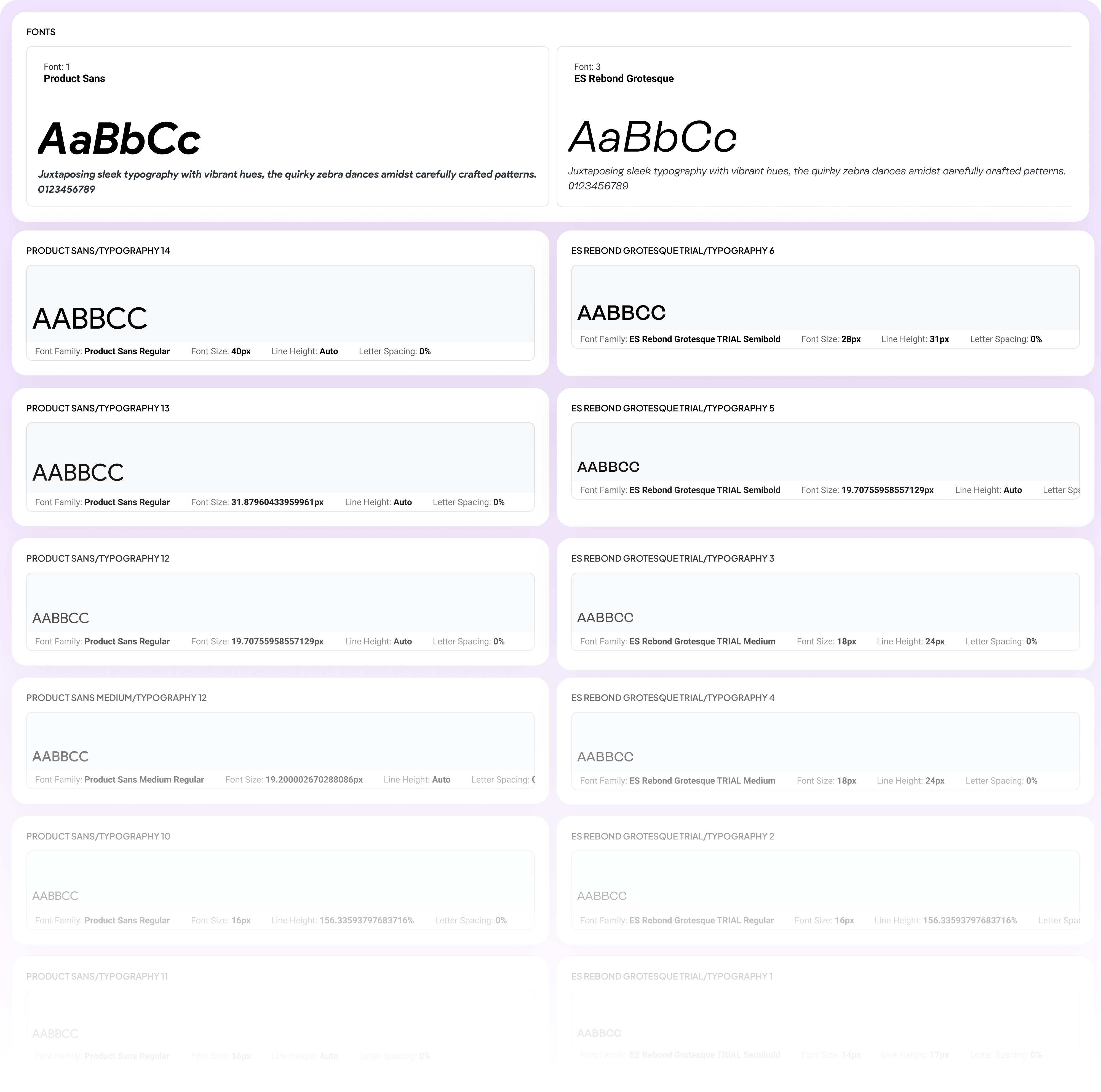
To eliminate inconsistency and elevate Glam9’s visual voice, I defined a clear typographic hierarchy rooted in purpose and brand personality. We chose ES Rebond Grotesque for headings, subheadings, and primary CTAs giving the interface a bold, confident tone. For body content and supporting text, we used Product Sans to maintain a clean, highly legible reading experience across devices. This combination wasn’t just aesthetic it was intentional. It helped improve content clarity, create visual rhythm, and enhance readability across screen sizes, from large phones to compact devices. The result: more accessible, scannable, and engaging UI content across the app.
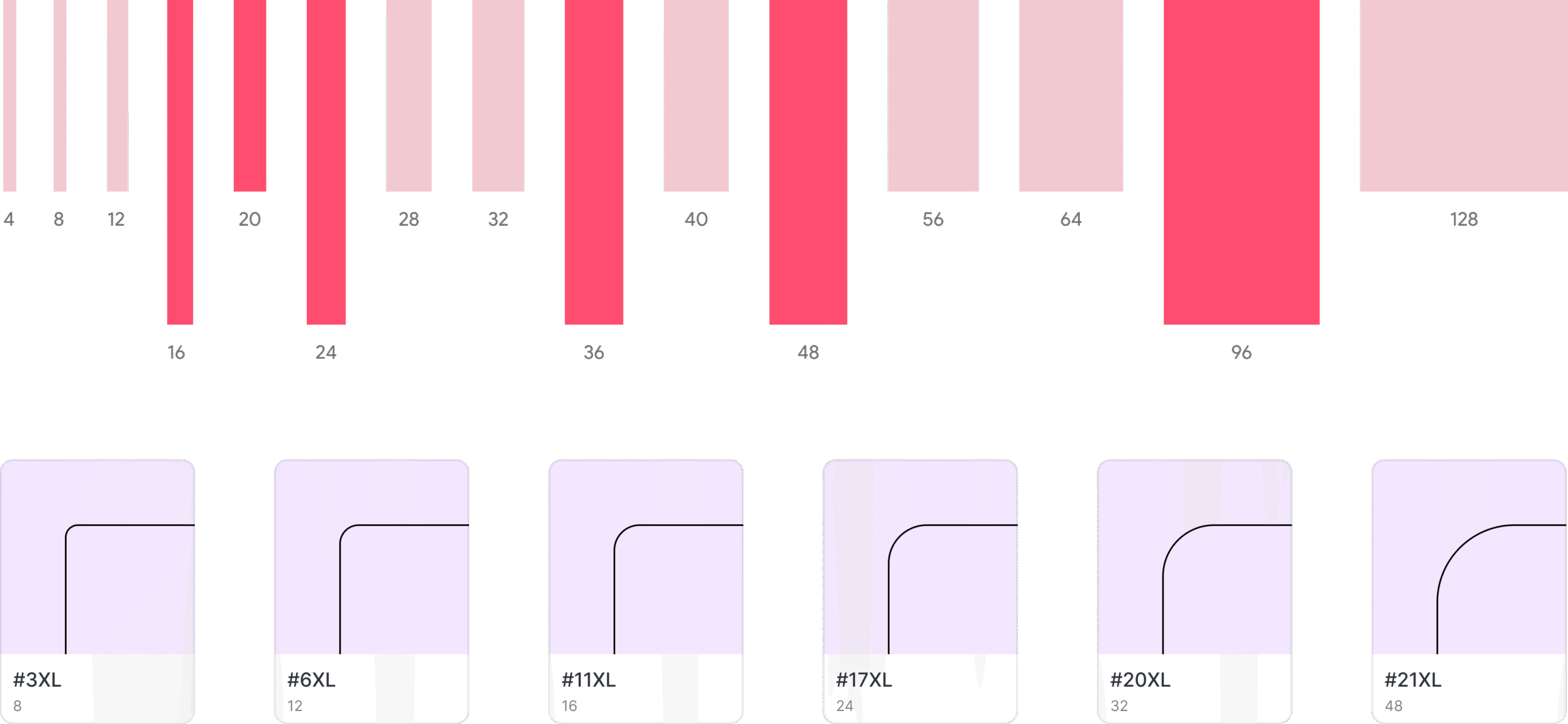
Spacing and Radius
To bring structure and consistency across Glam9’s UI, I implemented a token-based approach for spacing and corner radius. Using Figma’s number variables, I defined a scalable system for padding, margins, and rounded corners ensuring a predictable and cohesive layout rhythm across all components.
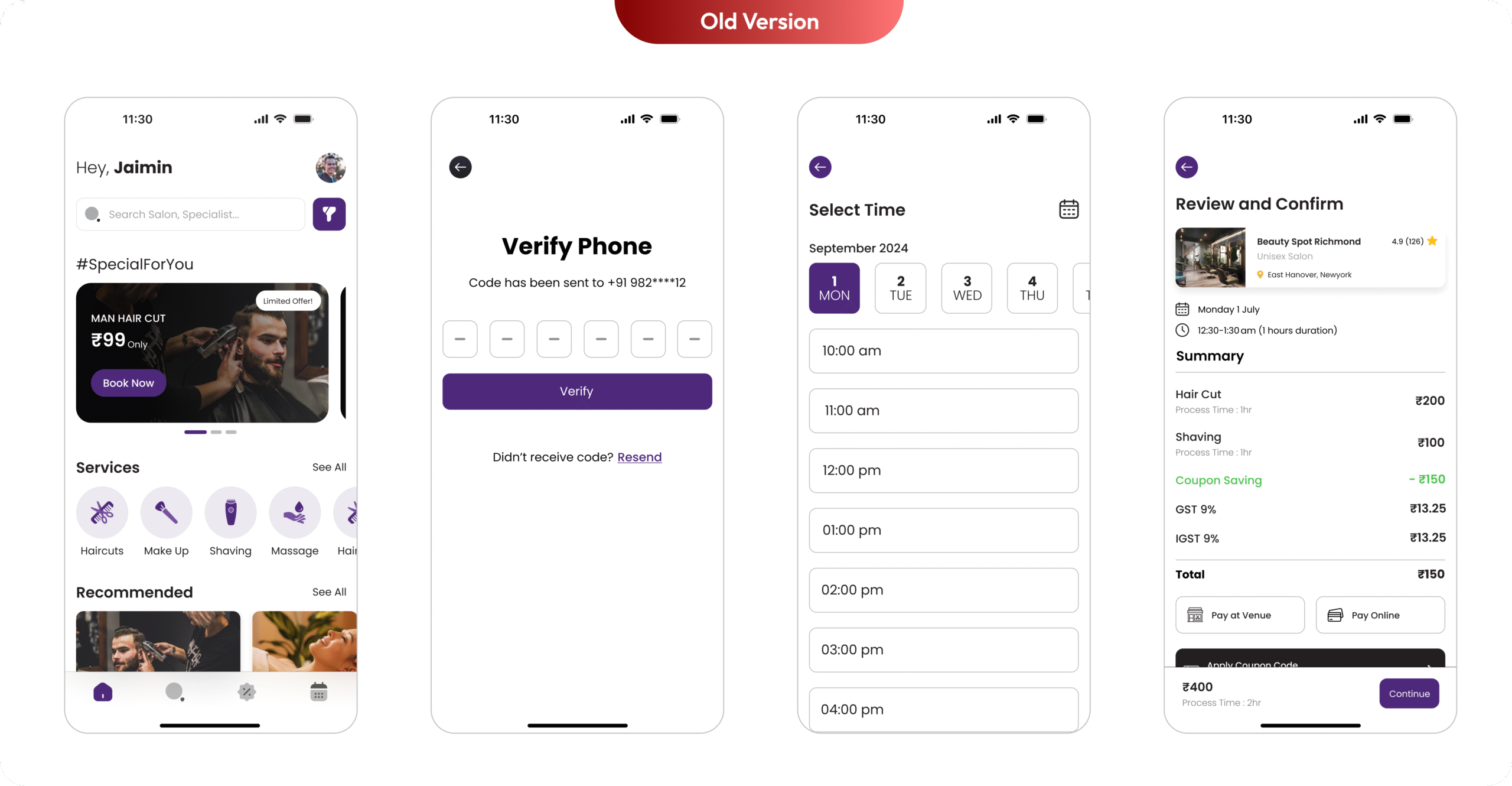
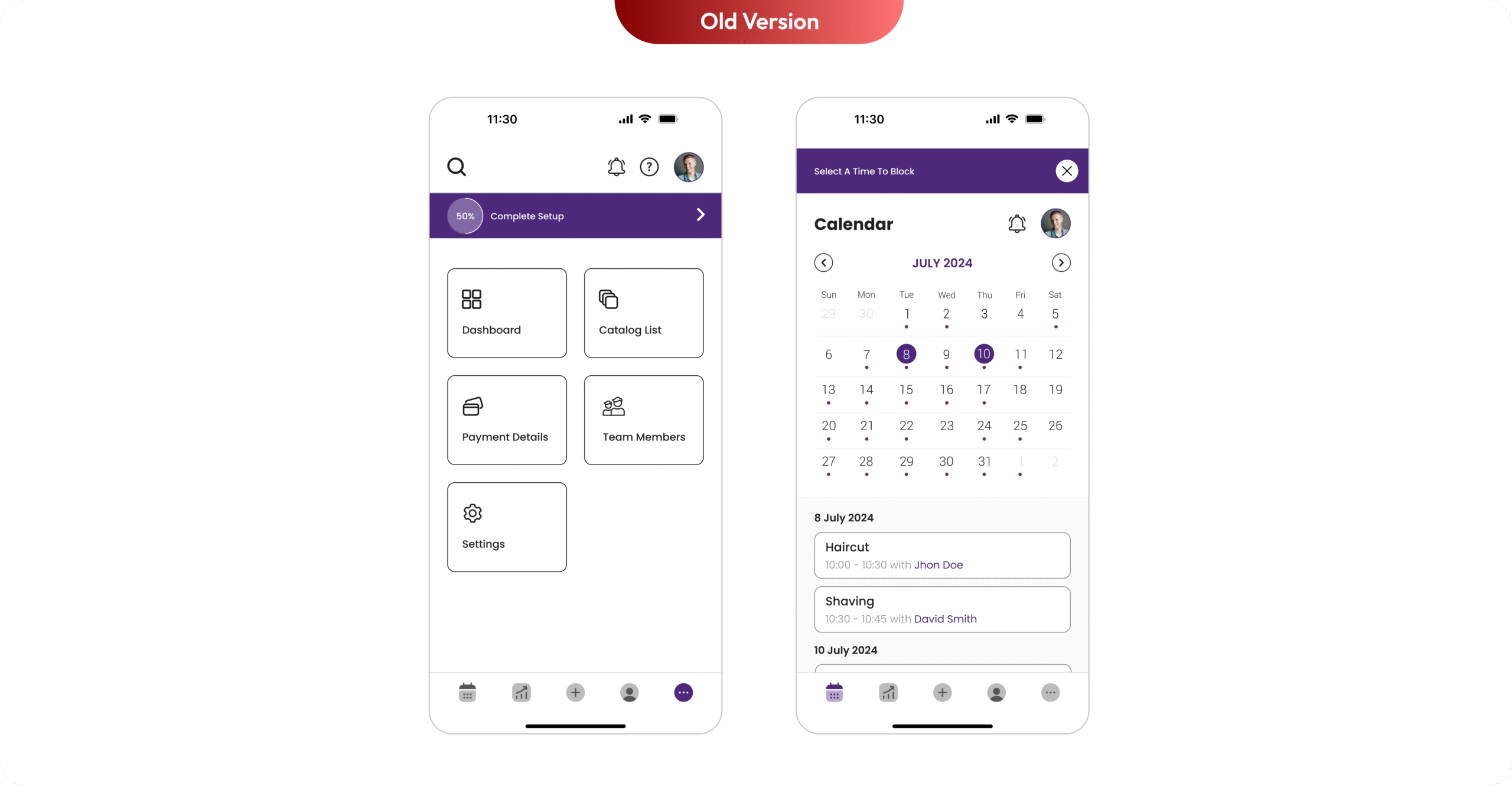
Implementation and Collaboration
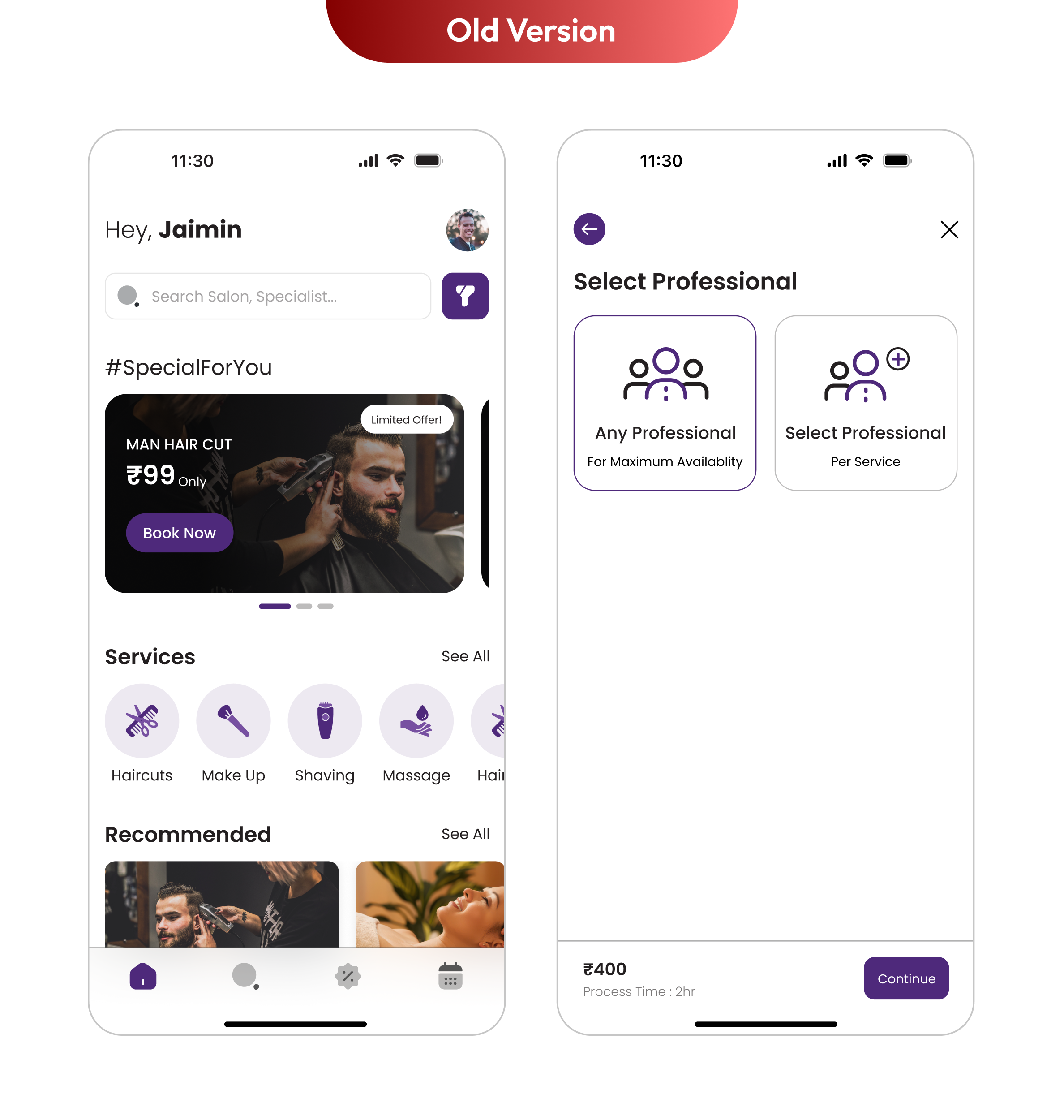
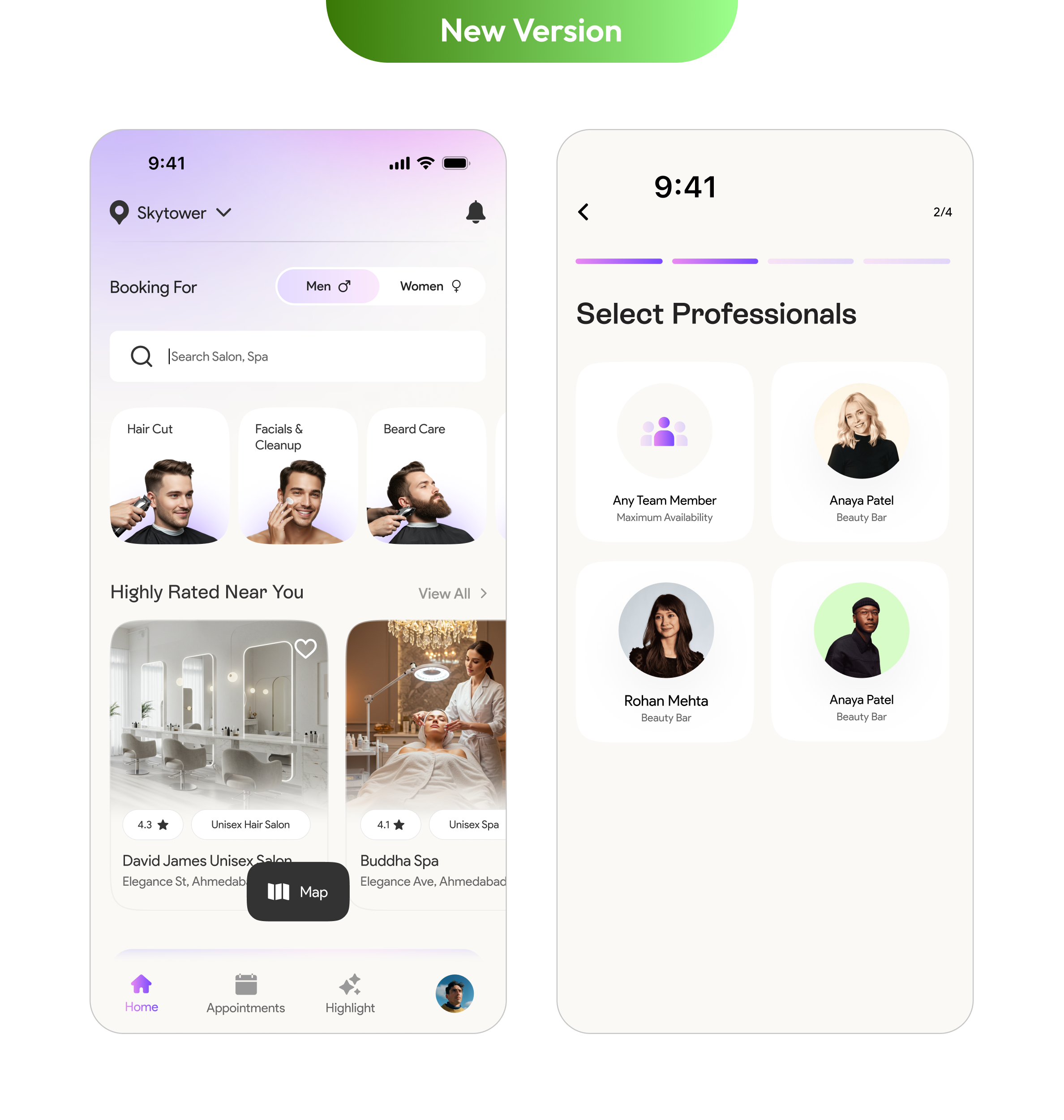
The journey from defining the design system to applying it across key screens like the Home Page and Select Stylist was filled with learning and iteration. Working closely with the tech team, we tackled the real-world complexities of integrating components into live features while maintaining performance and design integrity.
This phase required continuous dialogue, hands-on reviews, and flexibility balancing pixel-perfect visuals with development feasibility. The end result was a smoother, more consistent user experience that brought the Glow design system to life, one screen at a time.
It took a month to design and implement this across every screen on the app. With new and reusable components, we significantly saved bandwidth for both the tech and design teams